a) Bar chart

Pie Chart

Pareto Diagram

b) Pareto Diagram
- Better way to portray data.
- Show a descending order.
- Show 2 information in 1 graph.
- Cumulative polygon is draw in same scale.
c) Little @ no knowledge of company
Question 2.8
a) Bar Chart

Pie Chart

b) Bar Chart
Question 2.17
a) Ordered Array
....0 0 5 5 5 5 5 5 6 6 6 7 7 7 8 8 9 9 9 10 10 10 10 10 12 12
b) Stem-and-leaf
....0...0 0 5 5 5 5 5 5 6 6 6 7 7 7 8 8 9 9 9
....1...0 0 0 0 0 2 2
c) Stem-and-leaf
d) Concentrated at range 5 to 10.
Question 2.25
a)

b) Histogram

Percentage polygon

c) Cumulative percentage polygon

d) The strength of the insulators must be at least 1,500 pound
....to meet company's requirement.
Question 2.31
a) Total Percentage

(better rounding the percentage)
Row Percentage

(better rounding the percentage)
Row percentage show the different between tests in the day & evening by nonconforming and conforming.
Column Percentage

(better rounding the percentage)
Column percentage show the different between nonconforming & conforming tests in the day & evening.
b) Row percentage
c) Nonconforming laboratory tests is very different in the day & evening. Therefore director can cut the number of nonconforming laboratory test in the evening that run improperly to reduce the cost.
Question 2.38
a)

b) No relationship.
c) The higher-priced refrigerators not necessarily have the greatest
....efficiency. Yes, it is borne out by the data.
Question 2.68
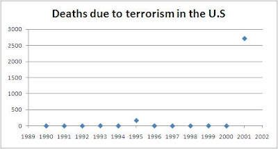
a)

From the graph, deaths due to terrorism in the U.S from 1990 until year 2000 is almost flat, and suddenly increase in the year 2001.
b) Bar Chart

Pie Chart

Pareto Diagram

c) Pie Chart
d) Most of the deaths in U.S is caused by heart diseases, followed by
....cancer & strokes and related diseases. These diseases may be caused
....from the lifestyle of the U.S citizens; the way they eat (fast food) that is
....not good for their health.
Question 2.81
a) Average travel-to-work times in minutes

Percentage of homes with 8 @ more rooms

Median household income

Percentage of mortgage-paying more than 30% of income

b) Histogram
Average travel-to-work times in minute

Percentage of homes with 8 @ more rooms

Median household income

Percentage of mortgage-paying more than 30% of income

Percentage polygon
Average travel-to-work times in minutes

Percentage of homes with 8 @ more rooms

Median household income

Percentage of mortgage-paying more than 30% of income

c) Cumulative percentage distribution
Average travel-to-work times in minutes

Percentage of homes with 8 @ more rooms

Median household income

Percentage of mortgage-paying more than 30% of income

Cumulative percentage polygon
Average travel-to-work times in minutes

Percentage of homes with 8 @ more rooms

Median household income

Percentage of mortgage-paying more than 30% of income

No comments:
Post a Comment